Steel & Tube
new office fitout
the brief
Steel & Tube were tenants in a building with compartmentalised office space across several floors. Our brief was to relocate their head office to provide an open plan design solution with a strong brand identity.

the challenges
Steel & Tube were rebranding during the design process so a full brief was not available initially. We had to provide an early design that was still flexible enough to allow integration with the final branding.
what we did
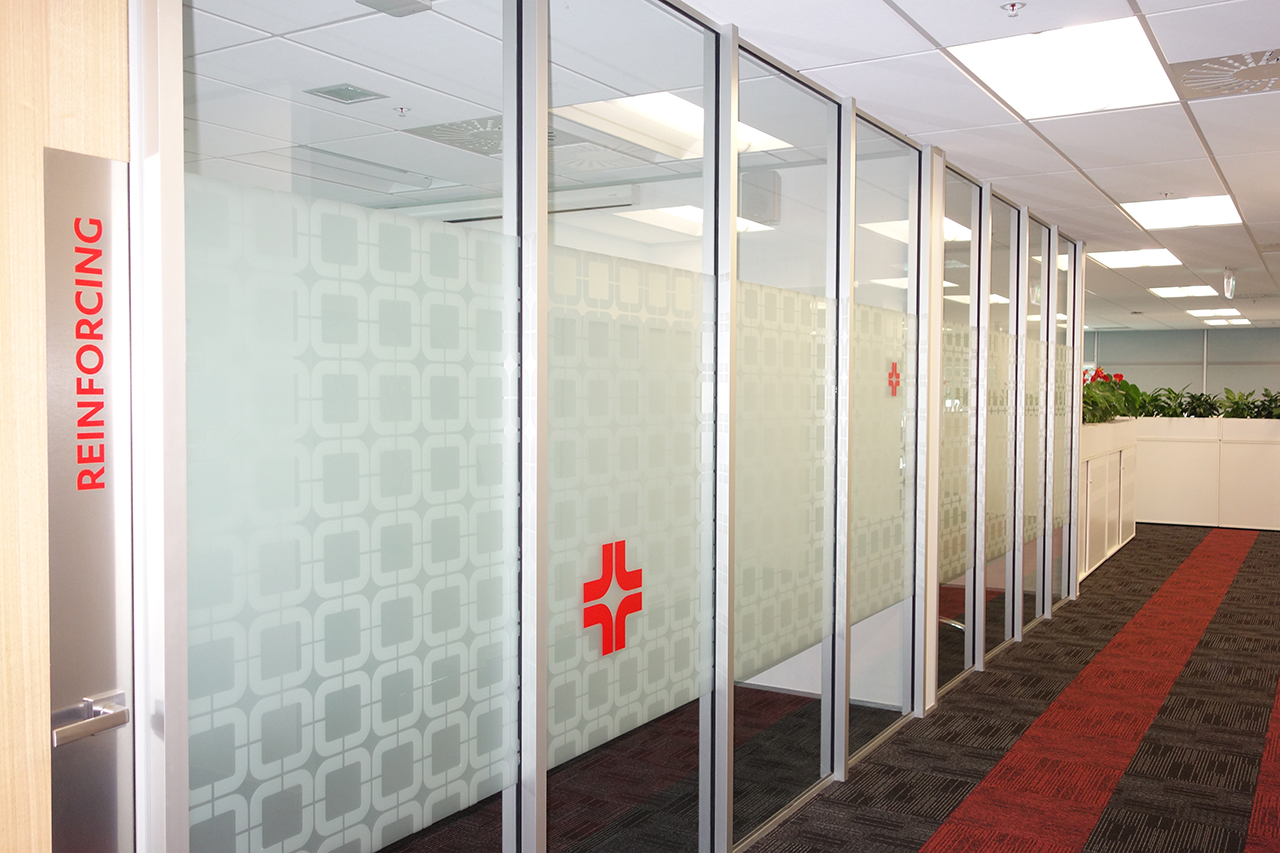
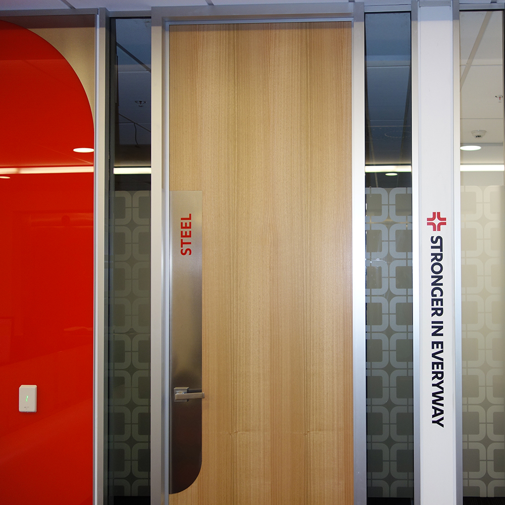
We worked closely with Steel & Tube’s marketing company to incorporate the branding into the architecture including the introduction of stylised logo forms to the reception counter, a feature wall, specially designed door treatments and glass partitions.

the results
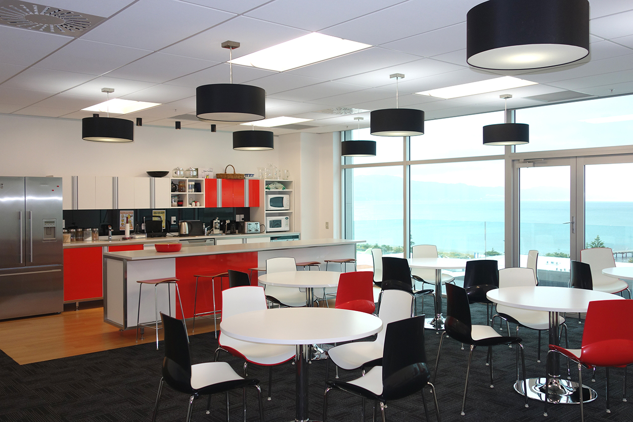
Steel & Tube now has a vibrant new head office, with floor to ceiling glass and dramatic 360 degree views and a cohesive brand identity throughout the fitout.

